Tiendanube
Your dream, your cloud
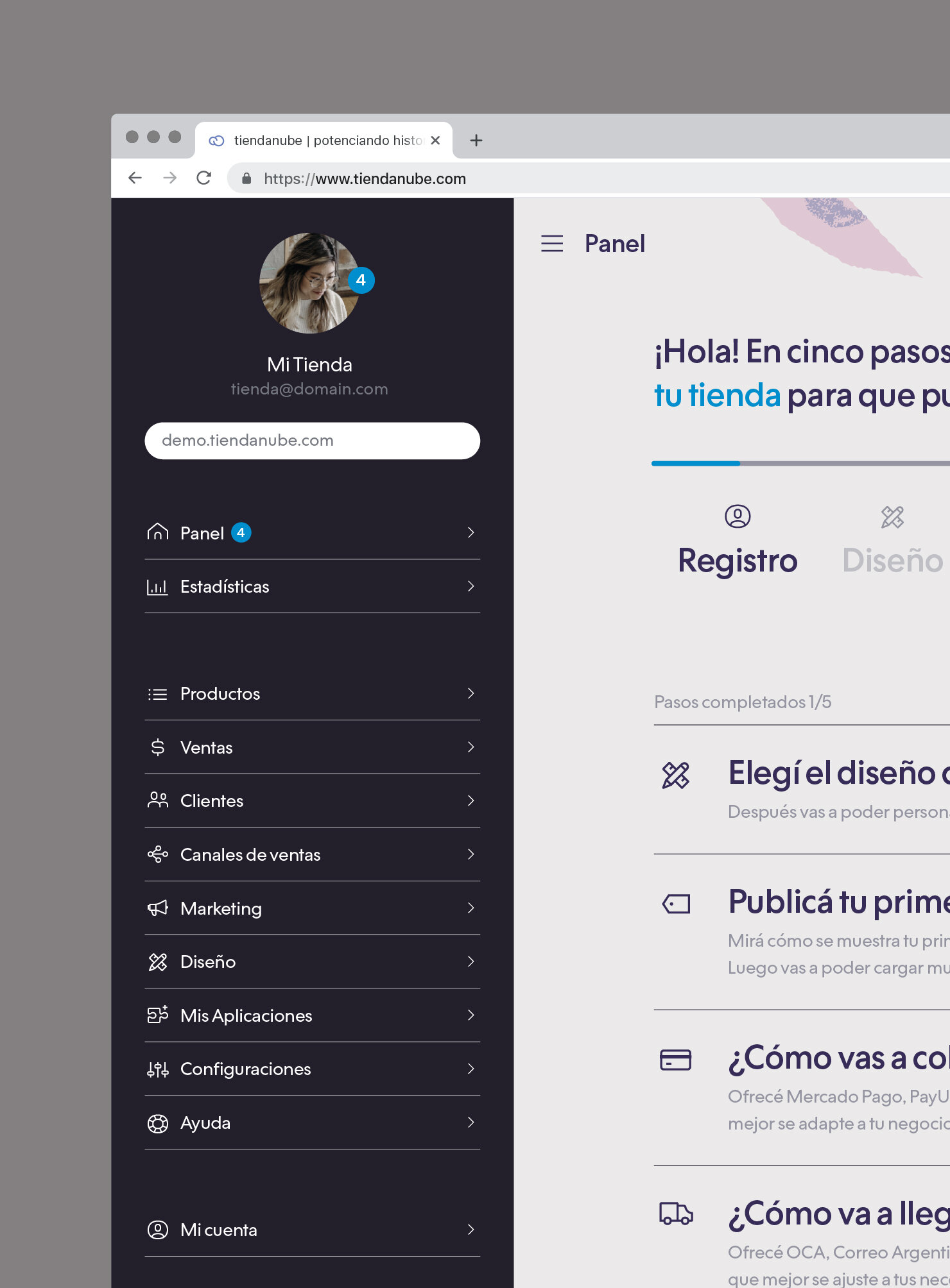
Tiendanube is the digital product that +25,000 brands in Latin America chose to boost their businesses. It’s a management tool that goes beyond an online store — integrating products, payments, and shipments with different sales channels such as Facebook, Instagram, marketplaces, and physical stores. We were chosen to re-imagine, re-think, and re-design their brand identity and provide a detailed brand guideline for its application.
Strategy
Positioning
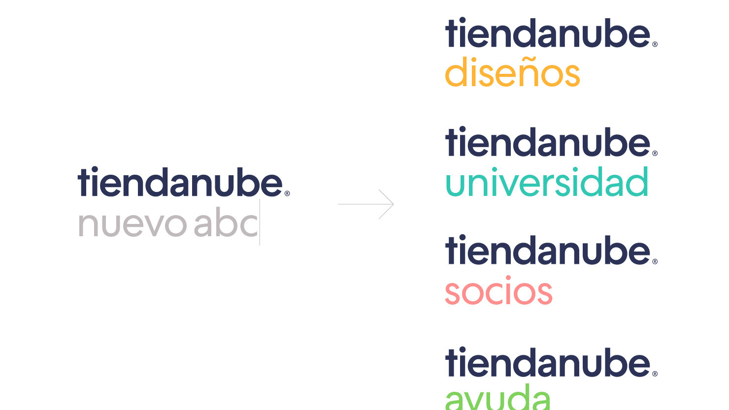
Brand Architecture
Branding
Visual Identity
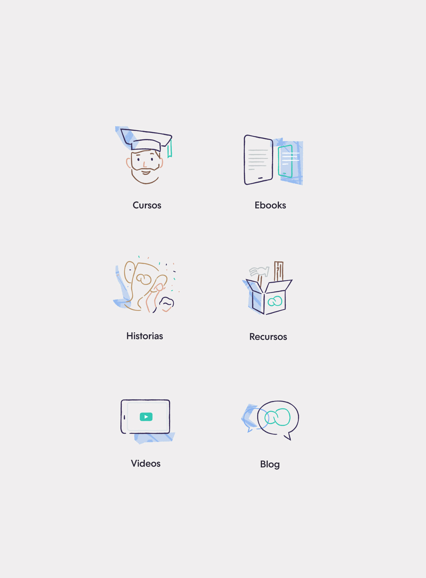
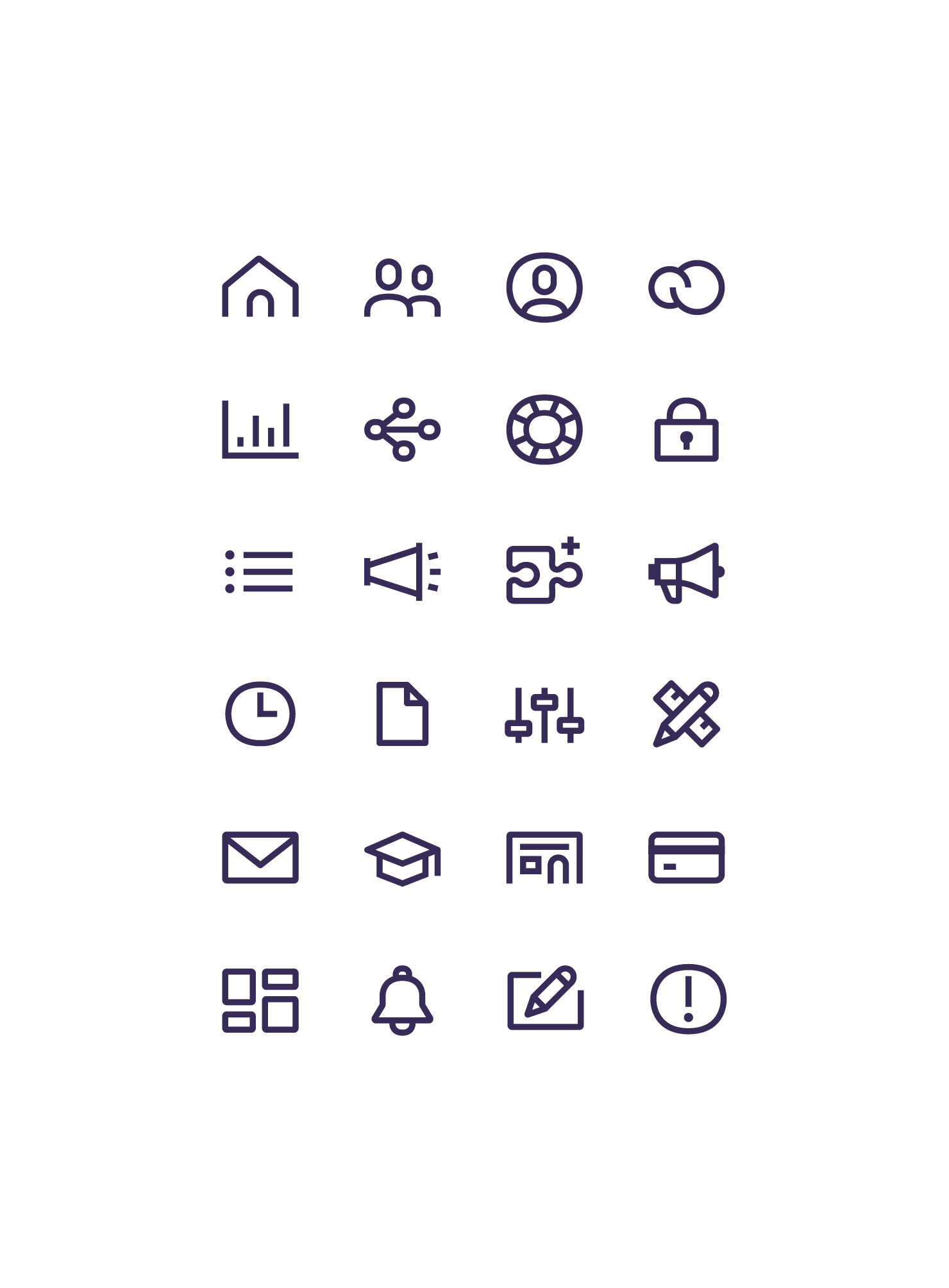
Iconography
Client: Tiendanube
Year: 2019
Country: Argentina & Brazil
Sector: Technology


The Challenge
Tiendanube is a prominent brand in the Latin American online stores segment, but it suffered from a lack of consistency and cohesiveness in its communications which sometimes looked dated or dysfunctional. The challenge was to develop an integral and clever brand architecture based on a relatable and strong brand concept and positioning, using a naming structure to solve existing problems. Also, to develop a complex visual identity system and a set of guidelines to ensure smooth implementation across different media platforms. These challenges applied to both Spanish and Portuguese versions of the brand.


What we did
We established a new brand architecture that’s easy to adopt and use. We delivered a whole new brand conceptualization and positioning strategy focused on performance, excellence, and most importantly — dreams and goals.
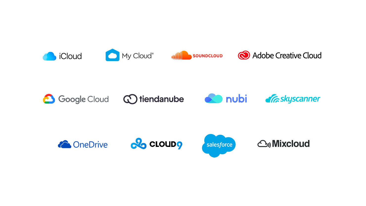
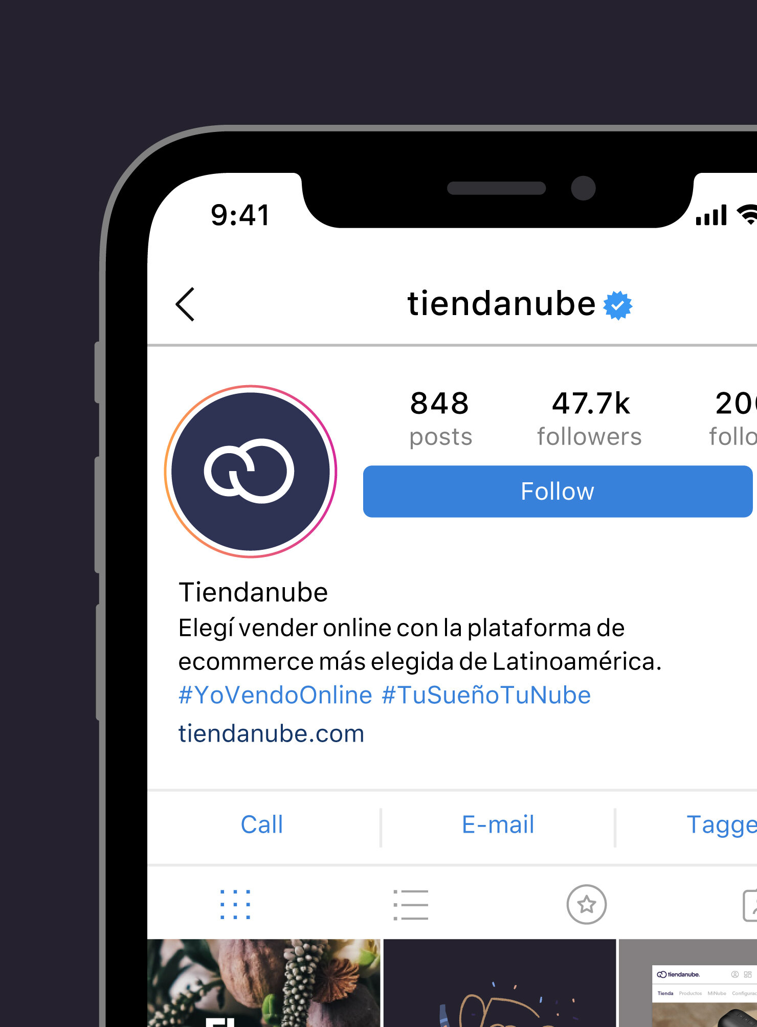
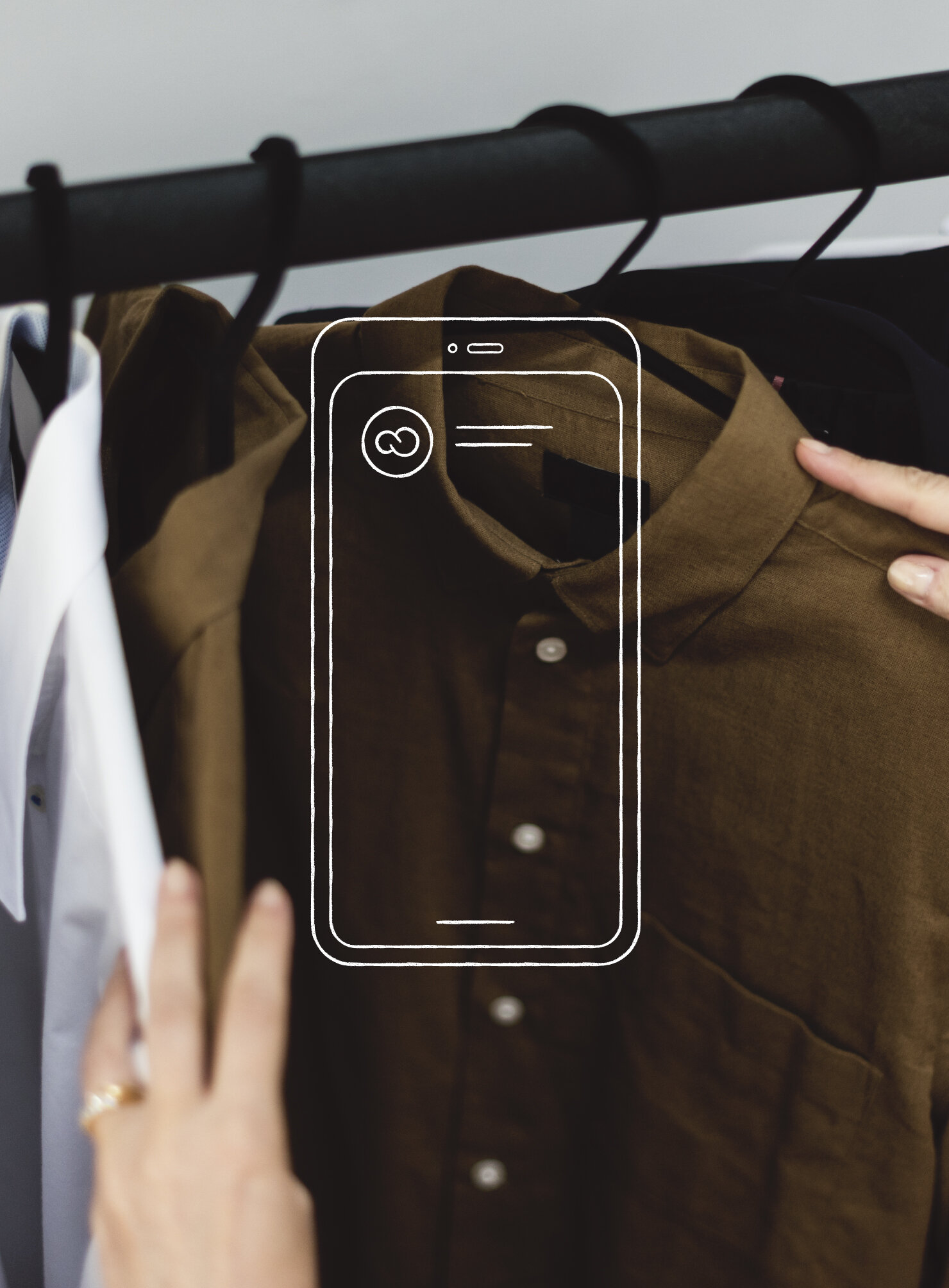
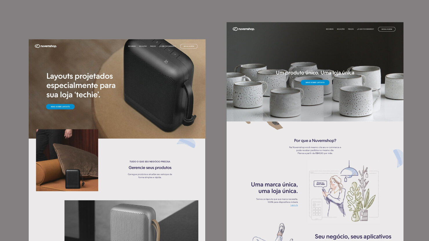
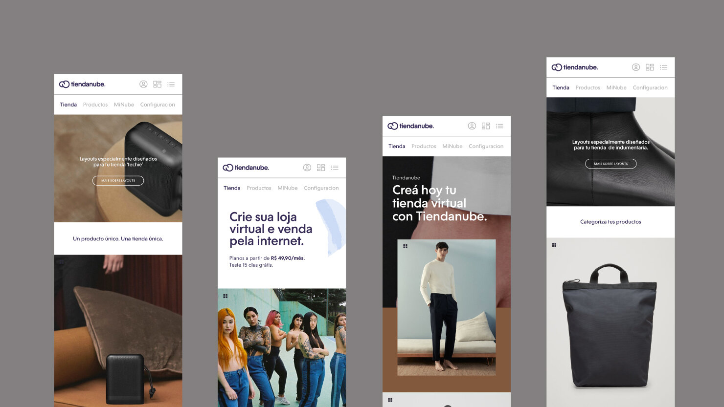
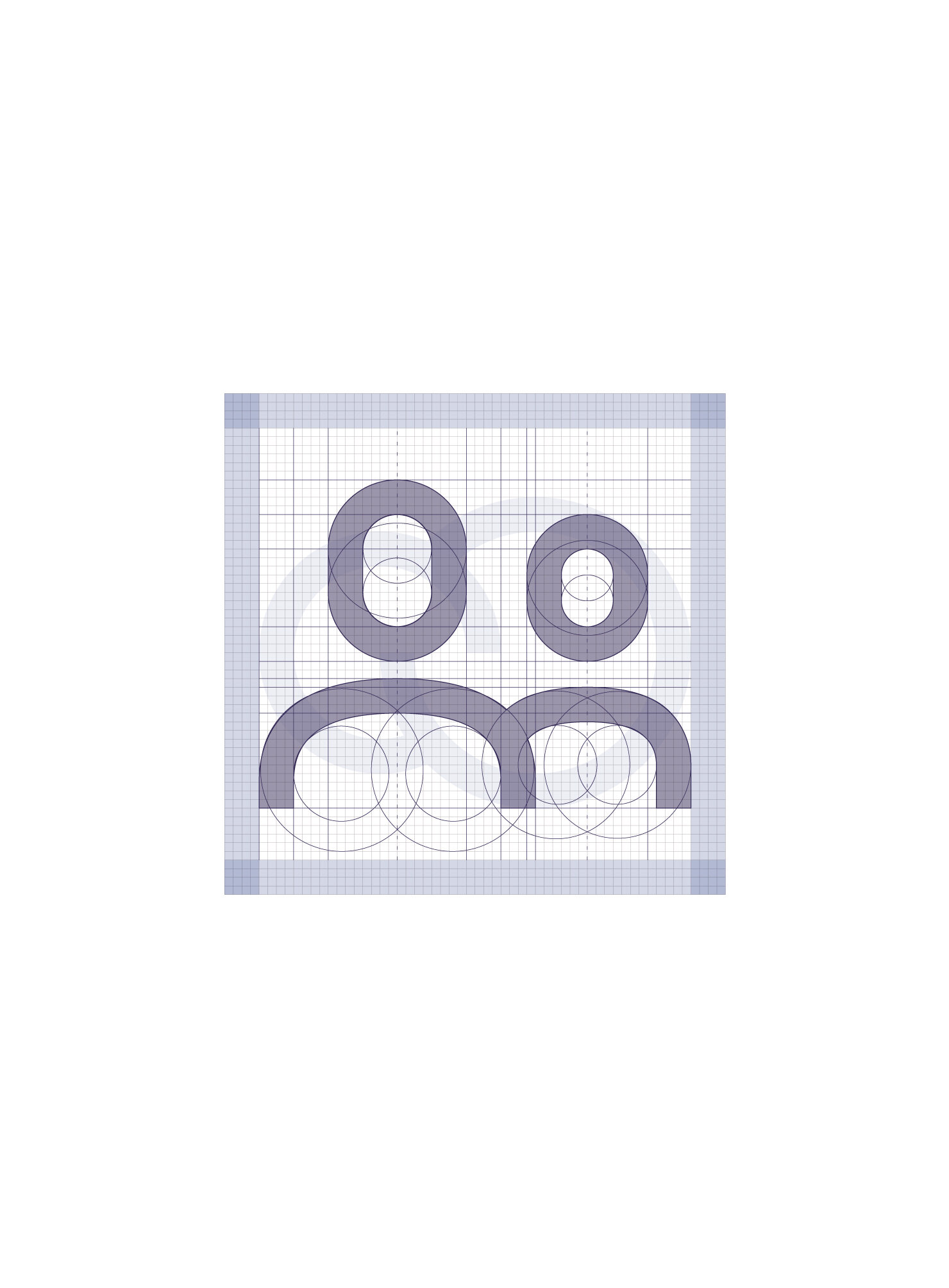
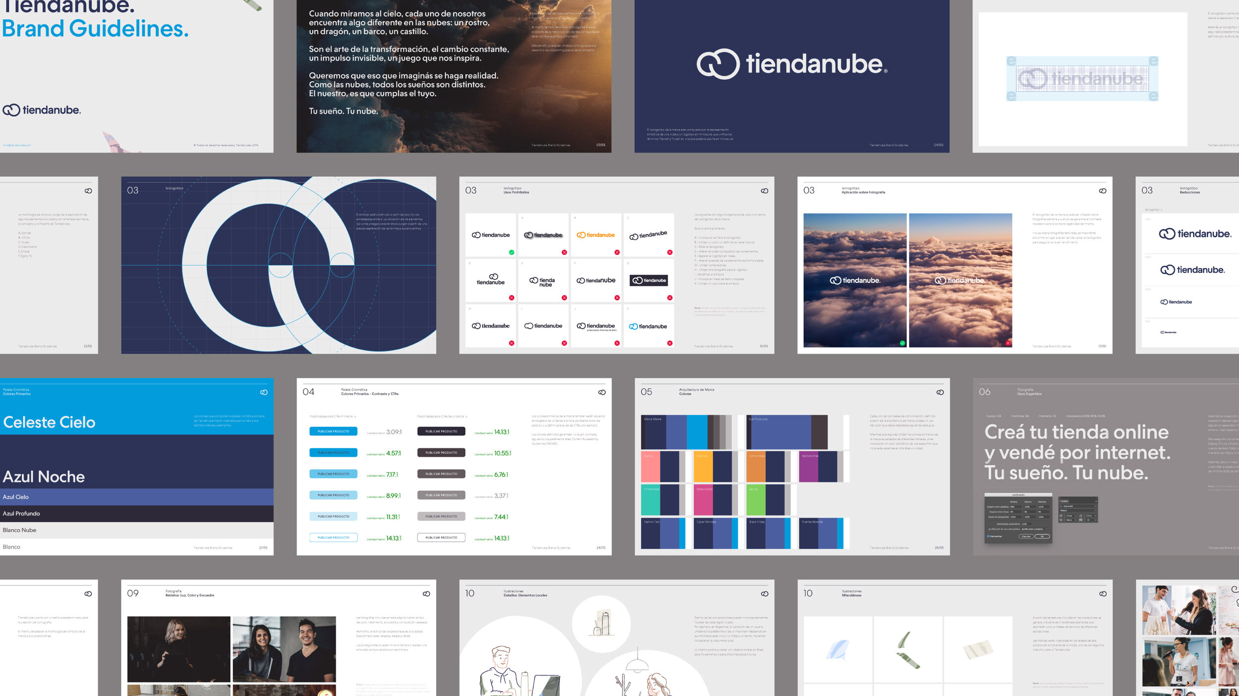
For the visual identity, we decided to get rid of the existing shopping bag and focus exclusively on the cloud, regardless of the possible similarities with thousands of other cloud-like symbols in the market, because the concept was worth it. We established a dynamic and functional wordmark that works for both languages along with a complete set of sub-brands and services.
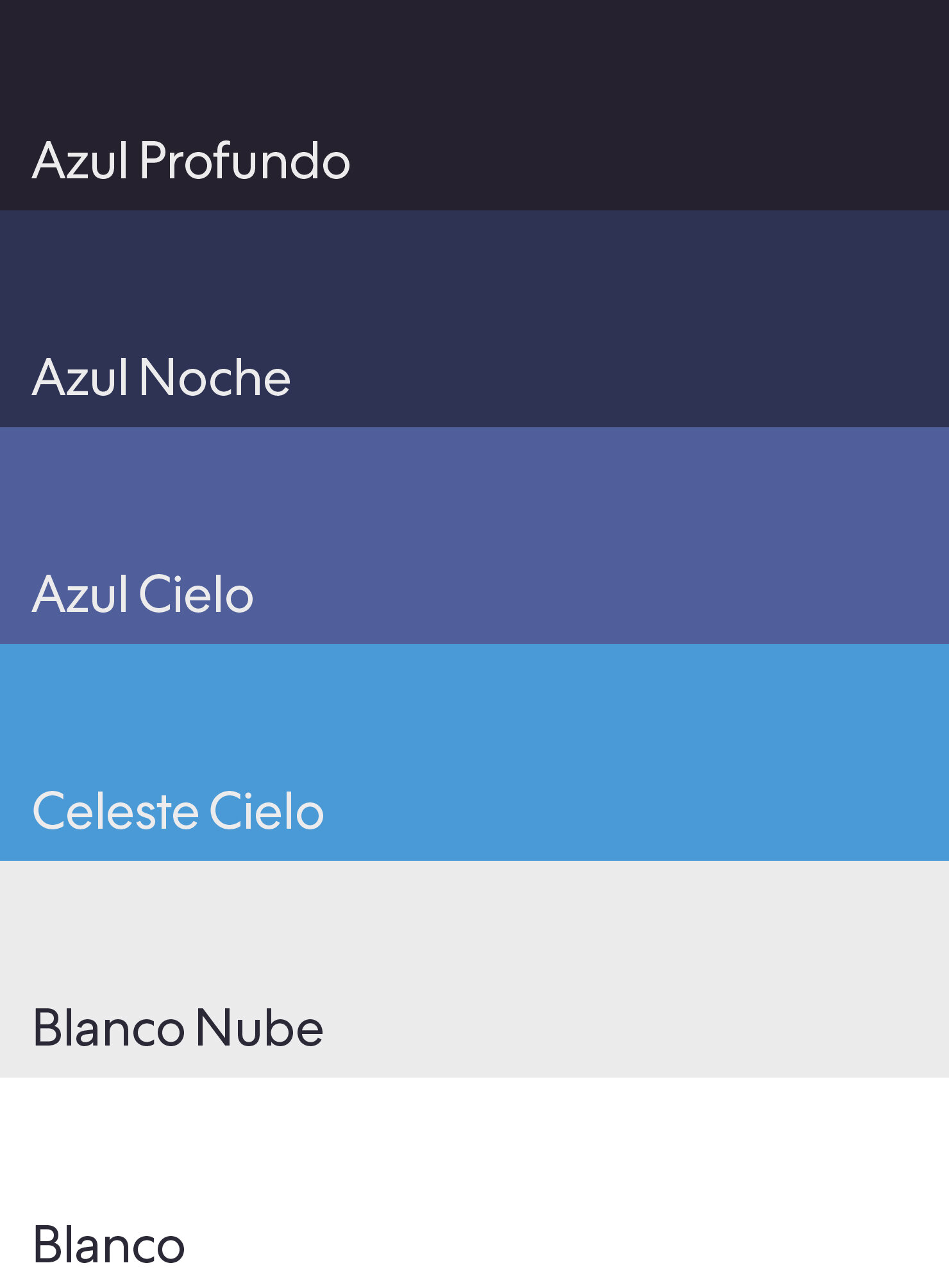
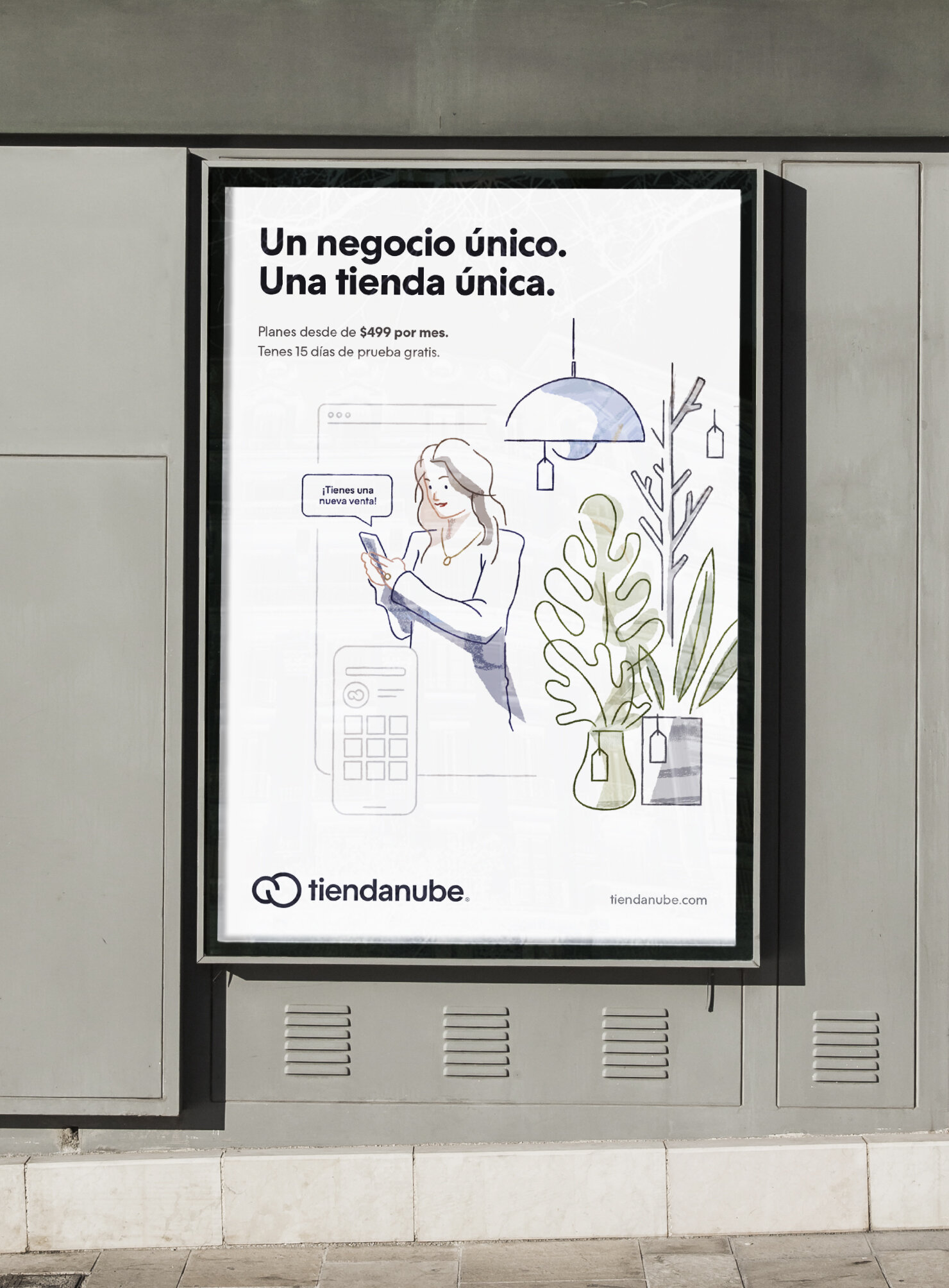
The brand identity system was completed with a color palette inspired by the skies, clean-looking typography, a vast set of expressive illustrations, collages, and custom iconography. As a final step, we delivered detailed brand guidelines that Tiendanube used to revamp everything from their offices to their current website.


Other projects you may like: